UX Rework
We’ve been working on a major UX overhaul of the Player Map to make it more intuitive, accessible, and aligned with how players actually explore data and can give feedback on game elements.
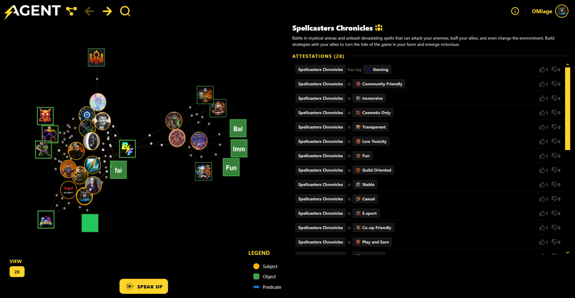
After workshop with game studios to be align with there needs, we redesign our attestation structure to have valuable game metrics.
🎯 Why this redesign ?
Our goal is simple :
Make the Player Graph understandable at a glance, while improving how users interact with feedback, identities, and relationships within the gaming ecosystem.
✨ What’s new?
🔍 Clearer Structure & Navigation
- Improved layout to better separate graph exploration and attestations
- Simplified top navigation for faster access to key actions
- More readable hierarchy between elements
🧠 Better Readability & Cognitive Load
- Reduced visual noise in the graph
- Improved spacing and grouping of nodes
- Clearer distinction between subjects, objects, and relationships
🗂️ Attestations Panel Rework
- Cleaner, more structured list of attestations
- Easier to scan, compare, and interact with feedback
- Better alignment with how players express opinions (tags, signals)
🎮 Player-Centric Experience
- Focus on what matters: players, games, and feedback
- Improved visibility of key game attributes (Fun, Immersive, Balanced, etc.)
- More natural exploration of the ecosystem
⚡ Faster Interaction
- Reduced friction to explore, filter, and react
- More responsive experience when navigating the graph
🌍 Why it matters
Player Map is not just a visualization tool. It’s a social and feedback graph for gaming.
This UX rework brings us closer to our vision :
👉 Making player data transparent, actionable, and meaningful
👉 Enabling studios to better understand their communities
👉 Giving players a real voice in the ecosystem
🔮 What’s next ?
🎯 Dashboard for studios
🎯 More AI-powered insights from the graph
We’d love your feedback 🙌
👉 What do you think about the new experience ?